 academic
Achmea fraud detection
2018, 26 FebThis was the topic of my graduation project at Eindhoven University of Technology, in collaboration with Achmea. It sparked my curiosity about the field of Explainable AI (XAI) and Visualization, which lead me to pursue a PhD about this topic.
The problem
Fraud detection is a difficult problem that can benefit from predictive modeling. However, the verification of a prediction is challenging; for a single insurance policy, the model only provides a prediction score.
We would like to know more about the decision-making process of the model. However, many machine learning models are black boxes and difficult to understand.
The solution
To aid fraud experts in their work, we designed two novel dashboards combining various state-of-the-art explanation techniques.
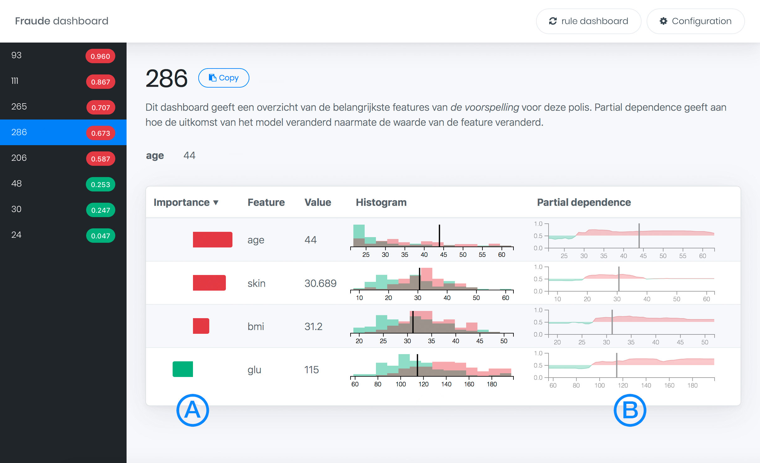
Feature contribution
This technique shows how much a feature of the data contributed to the prediction of fraud of one particular insurance case. This is computed using the local increment LIfc for a feature f between a parent node p and child node c
The feature contribution Fi,tf for an instance i is first calculated for every tree t in the forest as
Partial dependence
For a local understanding on a feature fa of instance i, n uniformly distributed points are sampled along the range of this feature. Next, n records with values of instance i of all features f with f ∈ F, f ≠ fa are created and the uniformly sampled values are used for feature fa. Finally, a prediction score is obtained for all n created records and plotted against the values of fa. The resulting curve shows how the prediction score changes when feature fa in instance i is varied.
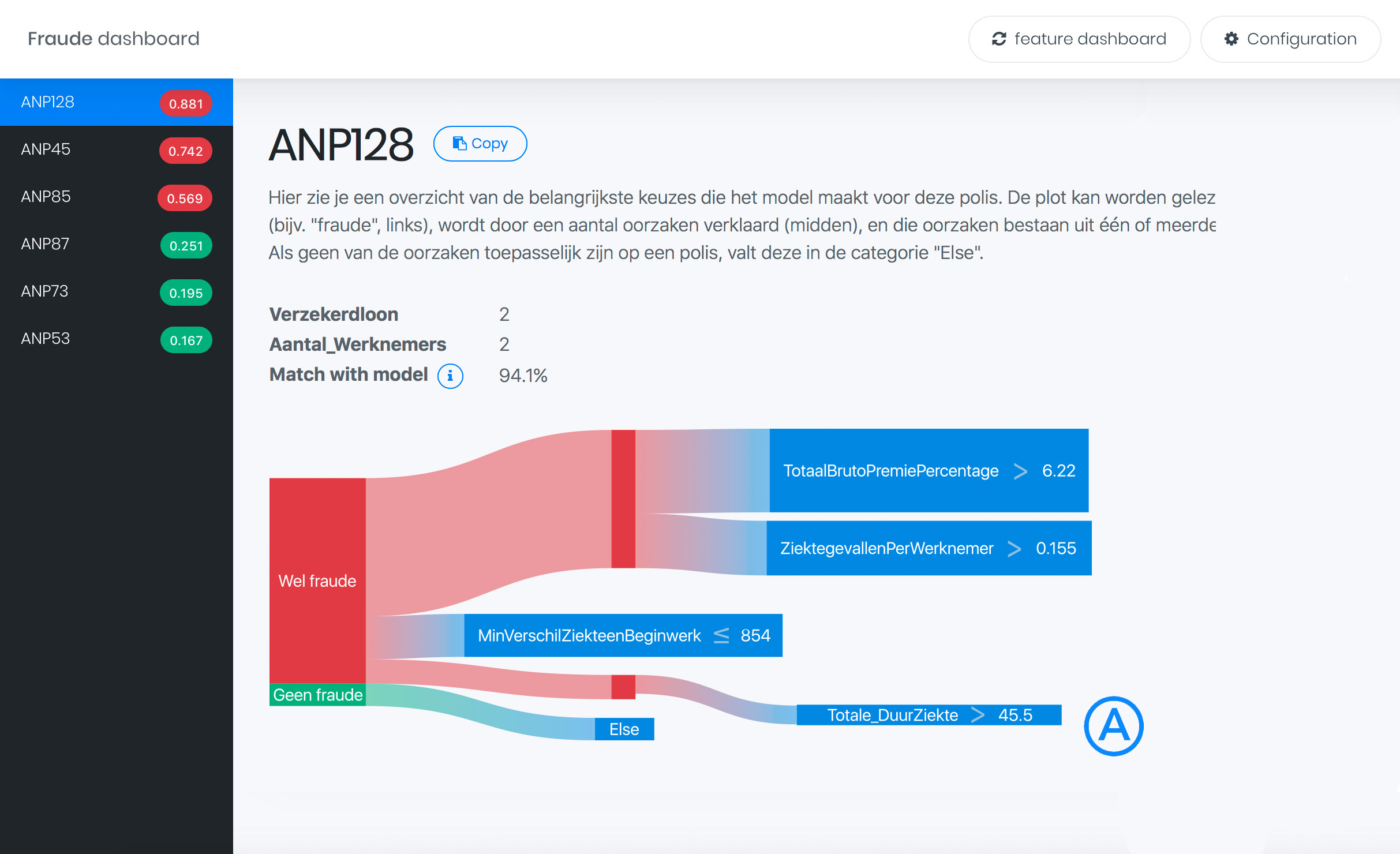
Local rule extraction
We created a new technique to extract locally relevant decision rules for a single prediction. We obtain these rules by evaluating them on a synthetic “pruning” data set generated around the instance which we want to explain.
Synthetic pruning data set is generated using uniform samples from an n-ball:
All decision rules applicable to instance i are extracted and pruned.
A Regularized Random Forest is trained on binary matrix of applicability of rules on the pruning dataset. Feature importance constitutes a metric of importance of individual decision rules.
These rules are visualized using a Sankey diagram as shown in the teaser image of this post and the last dashboard screenshot.
Results
The feature dashboard shows bar charts (A) expressing the contribution of a feature to the prediction. Additionally, partial dependence plots (B) show the impact of changing the feature value (indicated with a vertical line) on the prediction.

This rule dashboard shows a flow diagram (A) representation of locally extracted rules. The first node is the initial prediction, and the ratio between two colors indicate the probability as estimated by the model. All child nodes of the root are different rules that were relevant to this prediction, in this example there are four. The thickness of the lines corresponds with how important these rules were for the prediction. Every rule again splits in different feature constraints, and the thickness of the line corresponds with how much that feature contributed to the prediction.

We have written a paper about the case study we ran with Achmea, a leading insurance provider in the Netherlands. We describe the surprising findings during this project, and issues we ran into when applying these techniques in practice. The paper was accepted and presented at the Workshop on Human Interpretability in Machine Learning (WHI) at ICML 2018, one of the largest Machine learning conferences in the world.
 Dennis Collaris


